|
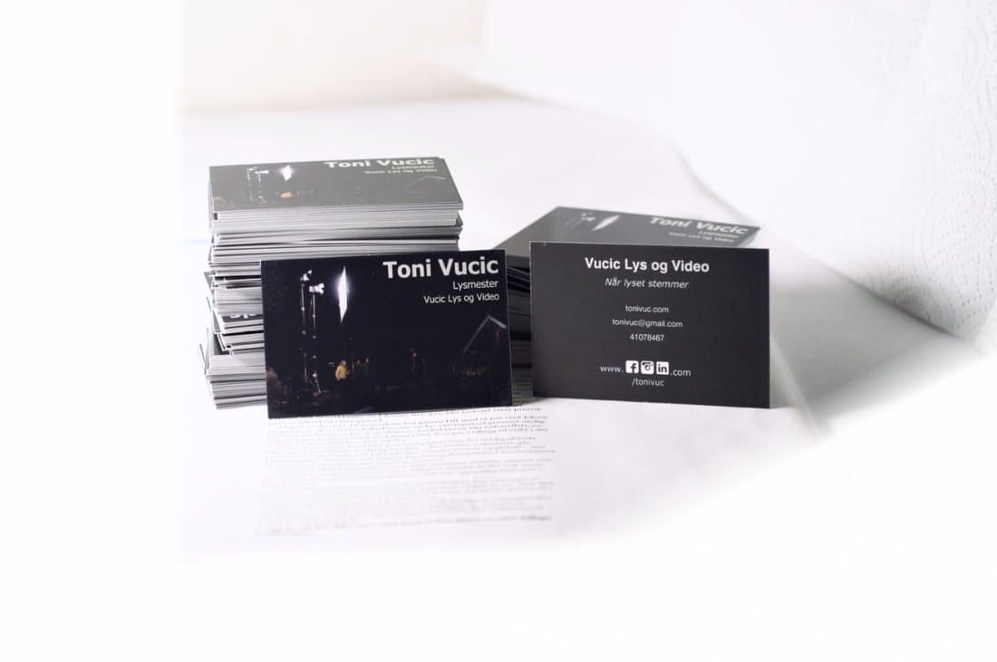
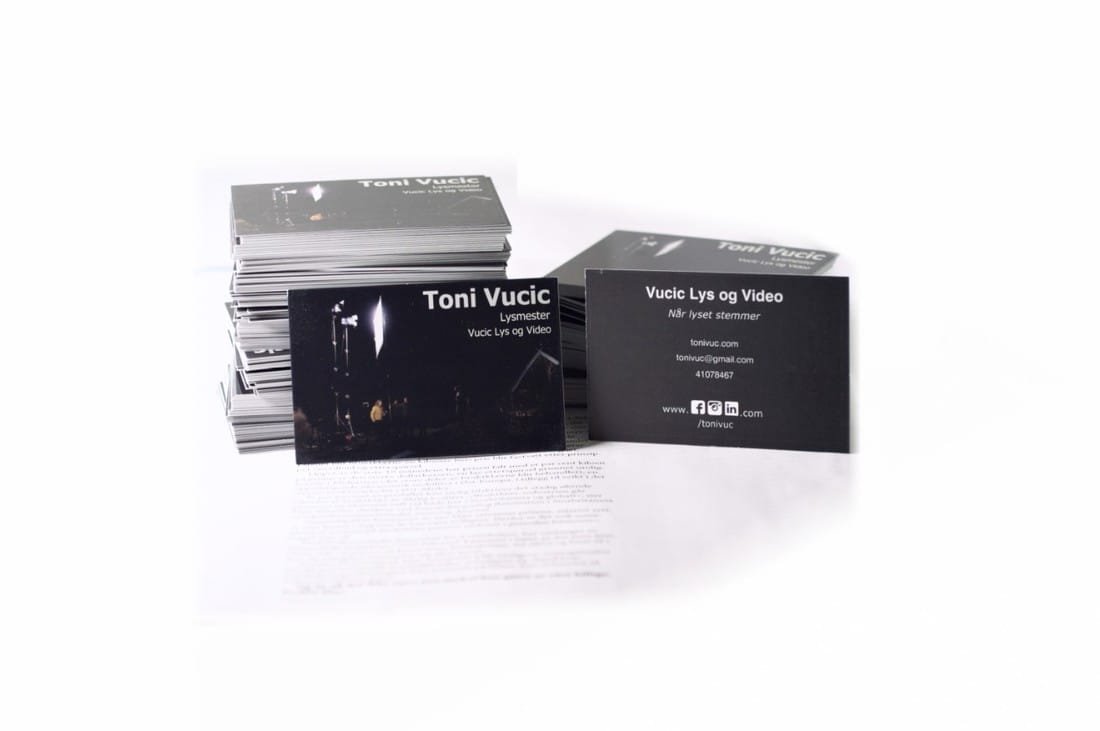
I finally got my business cards today! Here is a picture of them I put up on Instagram. I just thought I'd show you how I got this result in my living room. 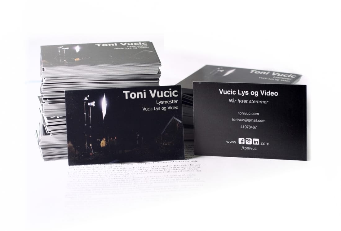 Final result after some editing This was accomplished primarily using my little ebay LED Light (Viltrox L132T), which goes for about 50$ on Amazon, with shipping. 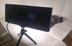 Color temperature is 4200 because it means all the LED-diodes are working. My 10 year old DSLR needs light. 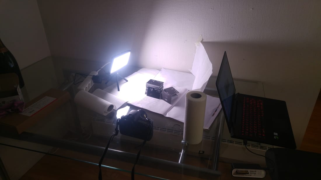 My glorious DIY studio. Didn't have any other white paper besides kitchen rolls. The one on the right works as fill too! With only one light it was pretty important where to place the key light. The position above is a compromise. Preferrably I would have angled it more towards the background, but I needed the exposure on the paper in front of the business cards to be bright as well. So this was where it ended up. Had I lit it frontally the background would hav been too dark. Maybe I could have lit it from above, but I noticed that the shiny cards facing up were prone to overexposing, and it could have ended up quite flat, so really this was the best choice in my opinion. Okay so why did I even bother with all thisSo I've been waiting for new business cards for over a month now. And I designed them myself so why not show em off now that they finally arrived eh? 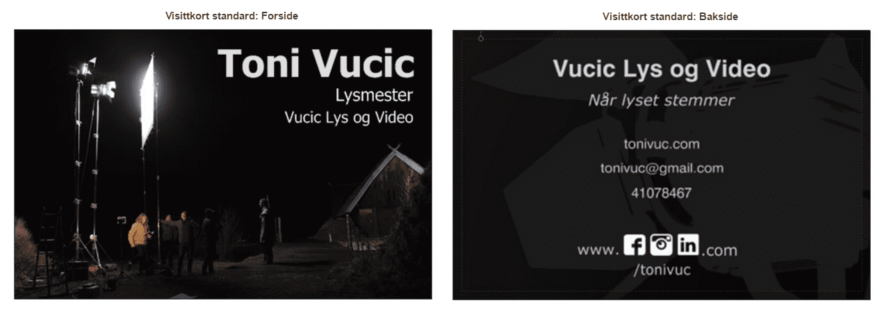 Well the above is what I ordered 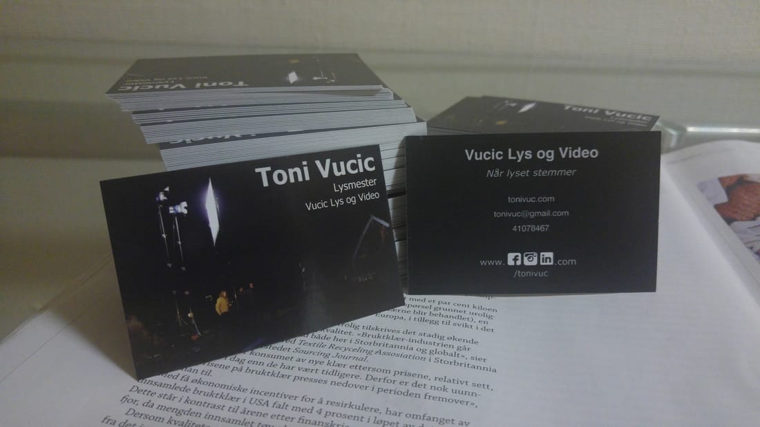 And the above is what I received, taken with my LG G4's cellphone camera. Now both you and I know that the picture above is just sad, so I had to do something. So out comes the new light. And I'm thinking, my shitty collective doesn't have any nice places to take a picture so I might as well block it all out. The first white thing I found was the magazine seen above. Then I found some kitchen rolls and finally I ripped an old A4 paper from an old exam to cover up the picture to the right. 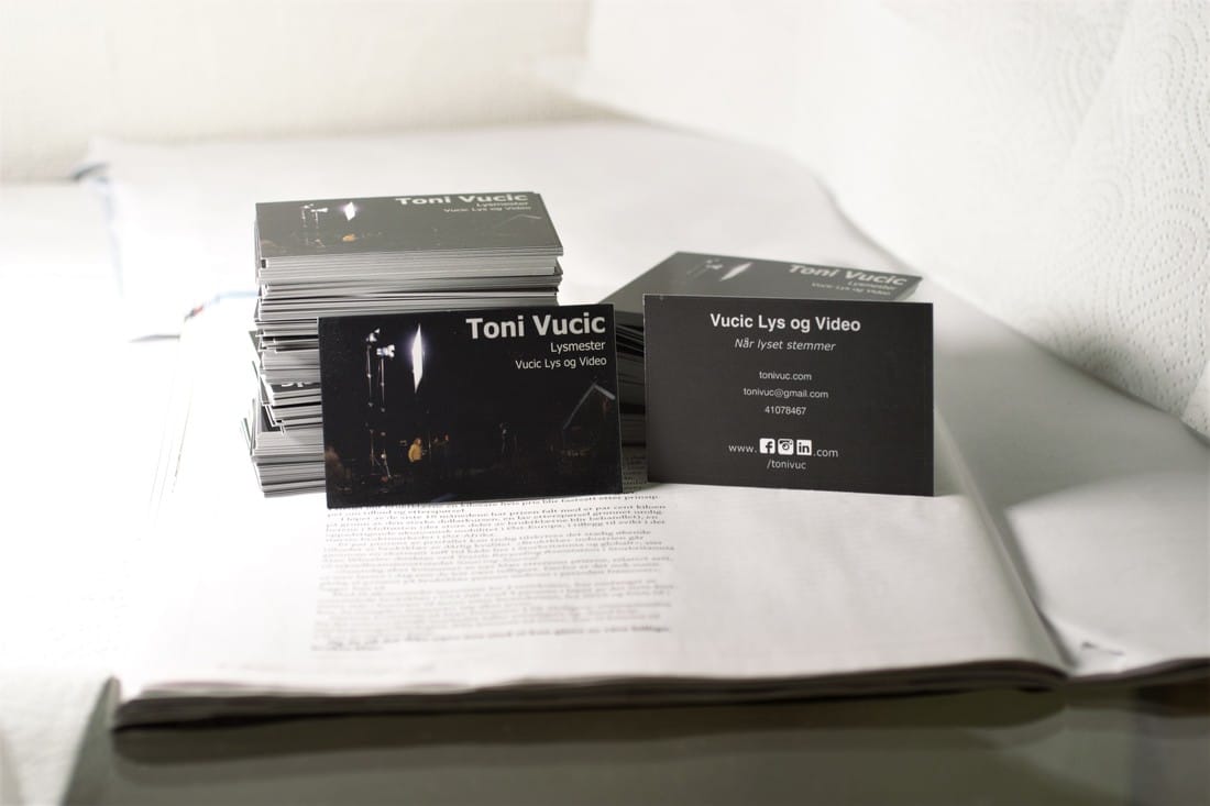 And out of the camera comes that. Now If I was making a movie obviously I'd need something else than kitchen rolls and a magazine, but static pictures gives some liberty to do stuff in post. I turn to my trusty friend paint.NET, a free image editing software for Windows.  So I start by blowing out the highlights. I guess this is as far as you could go with a moving image without fancy after effects work.
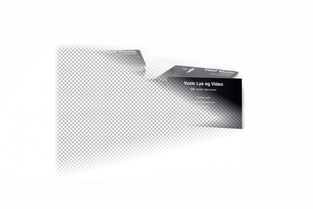
Step 1, 2, 3 is adding gradients that go from white to transparent around the image. Then in Step 4 I cloned the main layer, made it more contrastry, and made two gradients from that to transparent. Then I overlaid that on the main layer to make it all look white. Finally crop it in, and Tada! Getting a good image without all this editing?I think that if you overexpose more than I did, you could get a pretty white background. My problem was that the cards had white edges and risked burning out. So maybe if the entire object was very dark. Otherwise I think you would need more lights to light foreground and background seperately, and have a stronger fill light to ensure there are no dark areas.
I hope you enjoyed the post! Cheers!
0 Comments
Leave a Reply. |
AuthorI'm a freelance gaffer. I also do basic grip work. 
Archives
February 2020
Categories |
 RSS Feed
